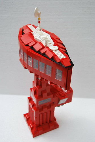
 Remember moonbase, you guys? The spacers' collaborative display meant to compete against train and castle layouts for the hearts of convention goers? Oh, the potential it had! It could have been so neat! The rules were broadly defined to maximize inclusivity, but as it turns out, at the expense of cohesiveness. Moonbase in practice was usually a neon-colored, patchwork mess, with more misses than hits.
 Legopard's lil red module here has a lot going for it: it has a distinctive shape, (moonbase was started in 2002, before they invented "techniques", making this difficult) it's tall enough that it rises above the first two floors, which would help contribute to the much-neglected moonbase skyline, and most importantly it is not in an ugly lego space colorscheme. Classic space, blacktron, ice planet, and mtron can look just fine on a pew pew fighter, but not on a building guys I mean seriously. Sticking to one bold color paired with neutrals is a much better plan, even if it's (oof) primary red. The support tower could benefit from the snot technique, but hey they got the main bit right. Good goin guy.
Speaking of moonbase, Jon Palmer posted the moonbase standard manual to his flickr, reportedly caving in to Eurobricks pressure. Now people can build it again, maybe!

I'd argue that the original Blacktron and Classic Space color schemes don't look too bad as a building, considering the lines themselves had bases and structures utilizing the scheme.
ReplyDeleteBlacktron in particular can look pretty dang awesome if used properly.
Emphasis on the "if used properly"
ReplyDelete