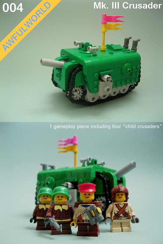
i built the lego tank pictured above. it is an original design, and it is not similar to the many other lego tanks i have assembled. how do you go about designing something NEW and FUN with your imagination and your LEGOs, dear reader? it is a difficult thing to do well, especially if you are a pretentious prick who is usually displeased with the way other people flaunt their "CREATIVITY". this informative poast is to help people answer this question. while there is no truly correct way to "EXPRESS URSELF", i hope you can respect my "CREATIVE PROCESS".
before we begin, an outline:
- know what ur going to build. in this case, an armored vehicle, maybe not a classic turreted tank, but it will have tracks and shooty things.
- "art direction". i want my armored vehicle to be "twee", that is, cute, colorful, and non compliant with the rules of ordinary STEAMPUNK. it is alarming how many dead horses there are to beat when it comes to "art direction".
- find similarities between what u want to design and real-life things. in my case, i will be drawing INSPIRATION from armored vehicles that were designed from world war one up to world war two, as after wwii humans had pretty much found out the best ways to kill each other with tanks so all their tanks stated to look the same (boring).
- find things that other people have designed that are similar to what you want to design. these are your INFLUENCES and can be "concept artwork" from things like cartoons and movies and video games. it is important that you do not rely solely on influences, or else you will run the risk of inbreeding styles and circle-jerking as illustriously described by matty in BP&B#18.
let us begin!
Pt: I INSPIRATION:
the tank above is a british mark IV. it is a part of a series that was developed during and used in the first world war, or as it is known as in places where the event actually mattered, "THE GREAT WAR".
details we can take away from this real-life design:
- the wrap-around tracks. they never built takes like this again because IT WAS STOOPID
- the sponson-mounted turrets, you know those guns sticking out the side. they are placed underneath the returning lenght of track.
- the driver cupola protruding above the tracks in the front. you shouldn't build a tank you cannot see out of!!
this machine is not a tank, but a steam-powered "road-less tractor".
- it is a good thing to equip oneself with at least some visual knowledge of technology from an era before fantasizing about it. take note, steampunks.
- i think the trapezoidal profile of this machine is more appealing than the rhomboid shape of the british tank.
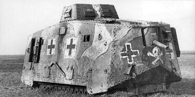
i like this tank this tank is great. it is a german A7V. it is not a trench-crossing vehicle like the british mark IV, but rather a big rolling armored house for looking fearsome in.
details we can take away from this real-life design:
- the door on the side for getting out quick, because if you take too much damage your vehicle will explode!!
- the armament on the nose of the thing is different from the sponson gun mounts on the british tank. because sometimes it makes sense to shoot at things you are facing.
- commander's cupola, placed up high in the center of the vehicle
- lots of little view ports for peeping out of, or sticking guns out of.
- a PIRATE SKULL so ur enemies can take u SERILUSY when ur spending A NIGHT "OUT" ON THE TOWN W/ UR BROS see below:
Pt. II: INFLUENCE
now that we have collected a small library of inspiration, we can move on to gathering influence from other things people have imagined. we must keep in mind that these influences have already been warped from what can be considered realistic or plausible for the sake of "aesthetics" or "play features" or "industry trends".

here is an old looking toy. you could say it is "vintage". it is made up to resemble the same family of british tanks mentioned previously. it is a pretty straightforward representation, no effort has been made to add "character" or "fun" to the design of the tank.
while simplified, the toy retains some details from the british tank pictured earlier in this poast. details like the sponson mountings and driver's cupola. these are good choices on the part of the toymaker because these details ARE IMPORTANT unlike EXCESSIVE GEARS, COGS, and SHINY TACKY EMBELLISHMENTS that normally classify "STEAMPUNK" and make stampunk A TOTALLY SHITE GENRE.
here are some original designs, from the gameboy game from Nintendo called "ADVANCE WARS":

details to tank away from these green earth tanks:
- no turret: the guns just stick out of the body.
- whereas the light tank (left) has "roadwheels", the medium tank (right) just has armor plating that fills in the wrap-around tracks, not unlike the olde brit tanks.
- i luv luv luv the exhaust pipes on the back of the medium tank. it reminds me of the exhausts on german tiger tanks from that other world war.
- there are not cupolas or view ports, the dudes just stick their whole torso out the top hatch. i don't like this feature but it goes to show the player THERE IS A MAN INSIDE THE MACHINE who will certainly DIE if ur vehicle takes too much damage!! is what we call "gameplay mechanic".
it is a good piece of artwork. it is a little bit too detailed, and barely manages to avoid being dismissed as "cluttered".
- i like the asymmetry.
- i really want to luv luv luv the crane, but i have to wonder, what is its use? it does not look sturdy enough to be used for towing another tank that might have taken damage. the only think i can think of is that is is used to hoist ammunition into the tank, but why doesn't the crew just shlepp them in thru a hatch?
- i like the hatch doors that meet at a peak on the tank's right side.
- i like the lower stumpy gun placed between the tracks. having multiple guns of different calibers was actually a real thing, like on the american m3 lee/grant tank which featured a 75mm mounted in the hull and a 37 mm gun in a turret.
- flags are good things to wave around.
- i wish it were less drab, but maybe this is a "bad guy" tank and they must not be confused with the friendlier looking "good guys".
oops i lied, sort of. i think it also pays to look at what our friends are building with LEGO, so that we can copy what we want to steal and improve on things we think we can do better than our friends.
Pt. III: THE OTHER KIDS ON THE "BLOCK"
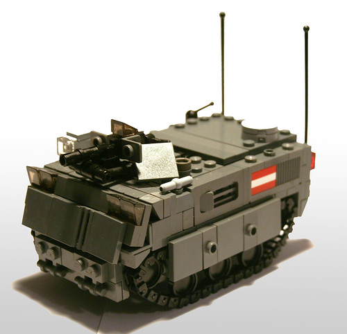
this is a creation by our friend, Nick Caster (kcaster).
- i luv luv luv the ports on the sides.
- the studs on the skirts and elsewhere are good texture.
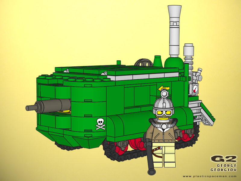
this is a creation by someone named george
- i like the color, my tank is the same color!
- i don't care for the way that the roof is tiled over, it could use something interesting, like a command cupola. cupola! CUPOLA
- while i wanted a visible exhaust on my tank, i didn't want greeblie anthills.
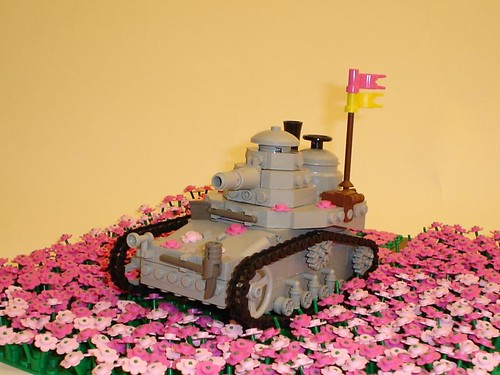
finally, this tank by our friend jonesy
- i look at this tank everytime i build a new tank.
- it is luv luv luvely in all the right places: it is interesting, plausible, and toy-like. you could say this about a lot of good LEGO my own creations, or even just LEGOs in general.
- damn what a good moc
again, here's what we ended up with folks.
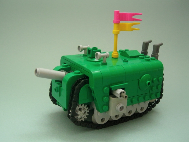
here is a list of the features we incorporated/stole from our range of inspirations and influences.
- general design
- takes after a similar combat role that the german A7V did.
- kind of totally ripped off of george georgiou's design, let me be honest it is green and retro and rounded. there exists an argument that this is not an entirely evil thing.
- big cannon sticking out of the front
- inspired by A7V, influenced by green earth advance wars units and valkyria chronicles artwork.
- wrap-around tracks
- inspired by wwi-era british tanks, influenced by green earth advance wars units.
- top side details
- it doesn't have a cupola, but i imagine the square doohickey ontop is a kind of periscope, so that a driver has a method of seeing forward.
- flag is ripped off of jonesy, perhaps literally as the story goes he gave the yellow flag part to matty, who gave it to me. jonesy actually took the pink/yellow motiff from an animu called "HOWL'S MOVING CASTLE".
- the 1 x 2 roof peak is influenced by the hatches i mentioned in the valkyria chronicles artwork
- side details
- i found a middle ground between the sponson weapon mountings on the british tank and the gun ports on the german tank. the little machine gun barrels on my model actually swivel!!
- you could imagine these are analogous to the neat window ports on Nick Caster's RAMM personnel carrier.
- the 2 x 2 dish is supposed to be a kind of hatch, it offers "visual interest". it was inspired by the doors on the side of the A7V, visible in one of the pictures. you know the ones "for getting out quick, because if you take too much damage your vehicle will explode!!"
- exhaust
- inspired by the advance wars graphics. it was matty who recommended i use power drills.
- garish colors
- the toy british tank is red and the LEGO tank by george is green. i have already built a tank in red so i though i would build one in green.
- familiarize yourself with how real period technology works
- you might even read about it how it works, rather than just looking at photos.
- when it does come time to fantasize, minimize the amount of influence you take in from other artwork, to avoid inbred aesthetics and tiresome stylistic circle-jerks.
- discriminate when it comes your influences, DON'T LOOK AT SHIT ARTWORK.
- also, don't absorb just one single style of influence. look at/watch/read/ a variety of genres.
- take a break from fantasy. build town, town is the best theme. if you find that building town is harder than building fantasy steam-powered star rocket submarines, then that means that town is TO REAL for you and you need to get out of imagining yourself into laziness.
- Tromas, who builds quality .SPACE and Maschinen Krieger things, also builds town.
- Tim Zarki (spook) mostly builds cool mechs and microspace, but he has also built town.
- Nick is probably most known for his drab military vehicles, but it his mid-20th century airplanes that turn me on fullest.




Great insight in the psychology of building.
ReplyDeleteI am happy to hear that you dig my .SPACE and Maschinen Krieger things, as well as, my town things.
ReplyDeleteThese are the types of writeups that are essential to developing a critical dialog in the AHOL community. Wonderful work, wonderful design.
ReplyDeleteI appreciate the thoughtful 'anti-pop' ramblings as well as the tank-amabob you have builded. Most especially I like the research and influences portion railing against the self-perpetuating nature of circular/inbred inspiration.
ReplyDelete