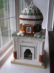
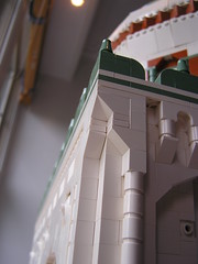
Firstly, the Shrine of Nasir ibn Brick, by Sandy Cash. The dome is notable, with an interesting technique, if we understand correctly. The color scheme, however, is more than questionable. What is most impressive, and primarily why it is here blogged, is the inverted-slope double-concave corner technique. This, sirs, is attention to detail. (Hat tip to our dear Matt for pointing this out.)
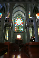
A close eye has been kept on Tony Sava's current project, the Cathedral of St. Francis. Sava has been in the past known for going big rather than detailed, but he seems to be successfully combining the two here. The front elevation is so nice I almost Chartres myself. He's even detailed the interior, guaranteeing (should he manage to get this to a convention) a weekend full of standing by, opening and closing it, while answering how many bricks it is, and if it is available in stores.
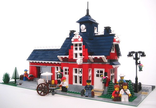
It is questionable that this is indeed in the past, not the present (which we promised to avoid), but either way, Igolando's Dover Train station is a charming delight. The darkblue tower is a bit odd (shouldn't it be red, with a blue roof?), but he shows that you don't have to use the rarest of rare colors to make tweeful treats.
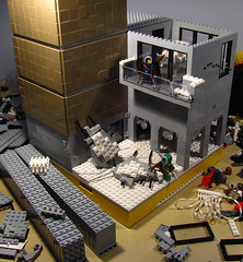
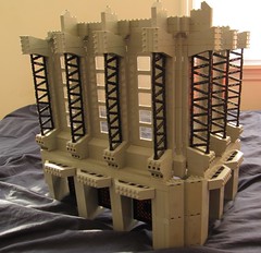
To the future! Futuristic architecture, and works that won't be complete until then. Tayasuune shows us his arctic apocalypse work-in-progress, with a minimal but positively golden tower block (what is this arctic apocalypse thing anyway? At least there won't be zombies.), and Carter treats us to this bit of tragically probably-never-finished industrial-gothic.
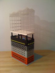
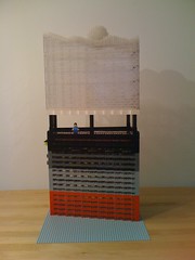
Finally, Mario Ander's "Elbphilharmonie leer," his take on Herzog & de Meuron's Elbe Philharmonic. Matt's German skills tell us that "leer" means "empty;" perhaps part of Ander's commentary on the project? The Hall will be Hamburg's tallest (likely superseding an historical landmark, which zoning had previously prioritized. "Akin to the US Capitol in DC, or the Eiffel Tower in Paris" you conjecture, though in both cases this is a myth; according to the zoning codes of each capitol, building height is regulated by street width, not set by any particular monument.) and has more than doubled in construction costs over the last 3 years: sure to generate controversy, unlike this blog.


I think Dover Train station is an example of how good activity and cleverly selected details will make even a bland building look good. That's a compliment.
ReplyDeleteI invented the inverted-slope double-concave corner technique in 2003 and even showed Jonsey a MOC with it last year WHY DIDN'T YOU GIVE ME CREDIT
ReplyDeleteWHYYYYYYYYYYYYYYYY